
11 Decor Colors That Make a Small Space Feel Larger


Decorating a small space comes with its own set of challenges. One wrong paint color can make a room feel dark and crowded, while the right shade can completely transform the atmosphere.
That’s one reason why color choice matters so much in compact homes, apartments, and smaller rooms.
The right tones can reflect light, soften edges, and visually expand the room without requiring any major changes to the layout.
Soft whites and pale neutrals have always been popular for this reason, but they’re far from the only option.
Muted blues, warm taupes, gentle greens, and creamy beiges can all help create an open and airy feeling while adding more depth and style to the space.

Another benefit of these colors is how timeless they are. Unlike trendy bold shades that can quickly overwhelm a room, these lighter palettes tend to age beautifully and work well with evolving decor styles.
In this article, we’re sharing 11 decor colors that make a small space feel larger while still keeping your home cozy, stylish, and full of character.
1. Bright White+Soft Greige Haven
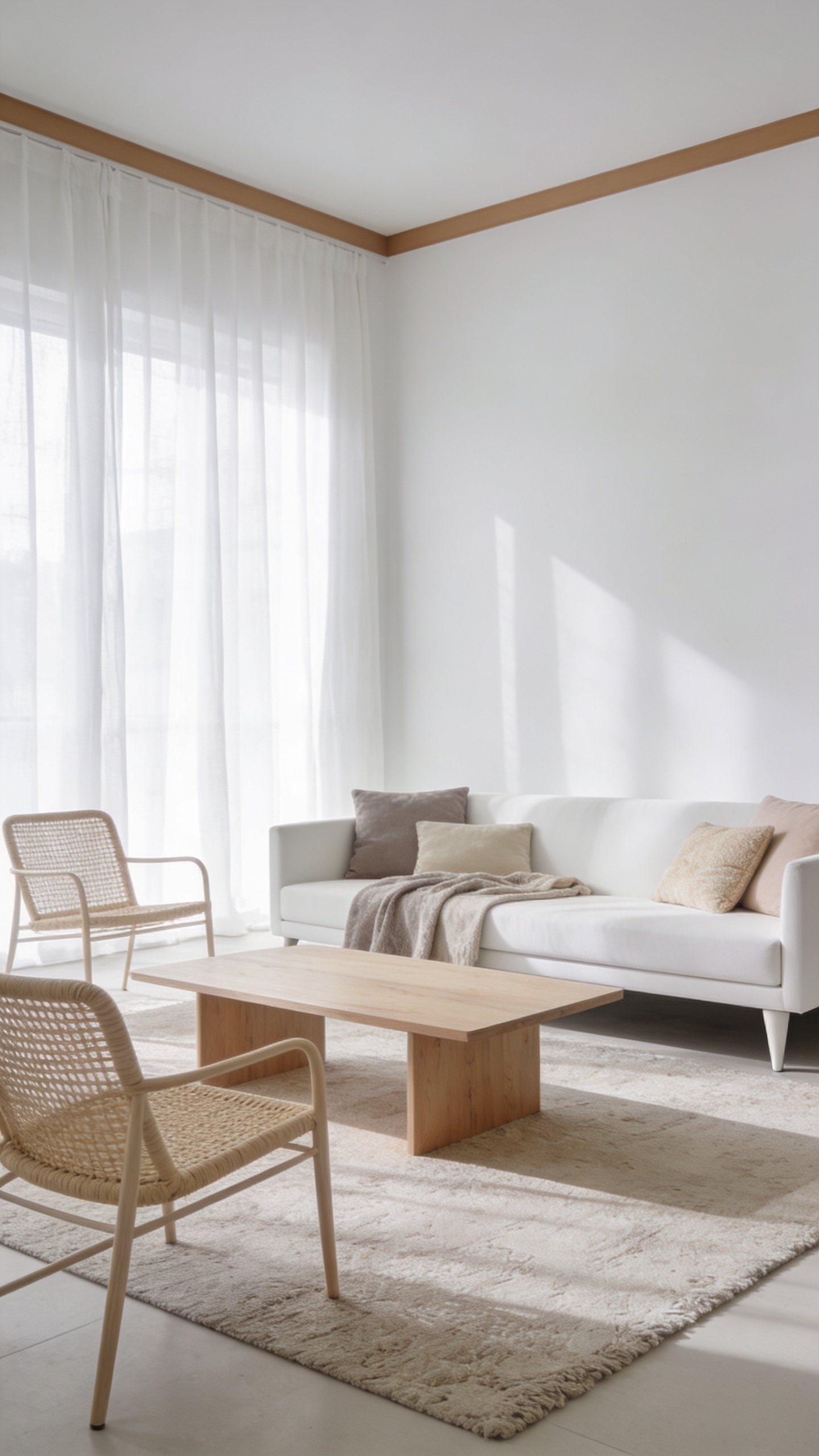
This design leans into a crisp, airy base with just a whisper of warmth. The space feels larger because the palette doesn’t fight for attention—it quietly amplifies light and airiness.
Color Palette
- Walls: peak-white or pure white with a touch of warm greige on trim
- Accent: soft taupe, pale sand, and oatmeal textiles
Key Pieces
- Low-profile white sofa with slim legs
- Natural wood coffee table and light rattan chairs
- Sheer white curtains that skim the floor
Styling Tips
- Use monochrome tones across furniture to keep the eye moving
- Incorporate reflective surfaces (glass coffee table, polished metal)s to bounce light
- Add greenery for a fresh punch of color without clutter
Why it works: the minimal contrast makes the ceiling feel higher and the room feel effortlessly clean. Great for tiny living rooms or studio apartments—seriously, it’s like a breath of fresh air.
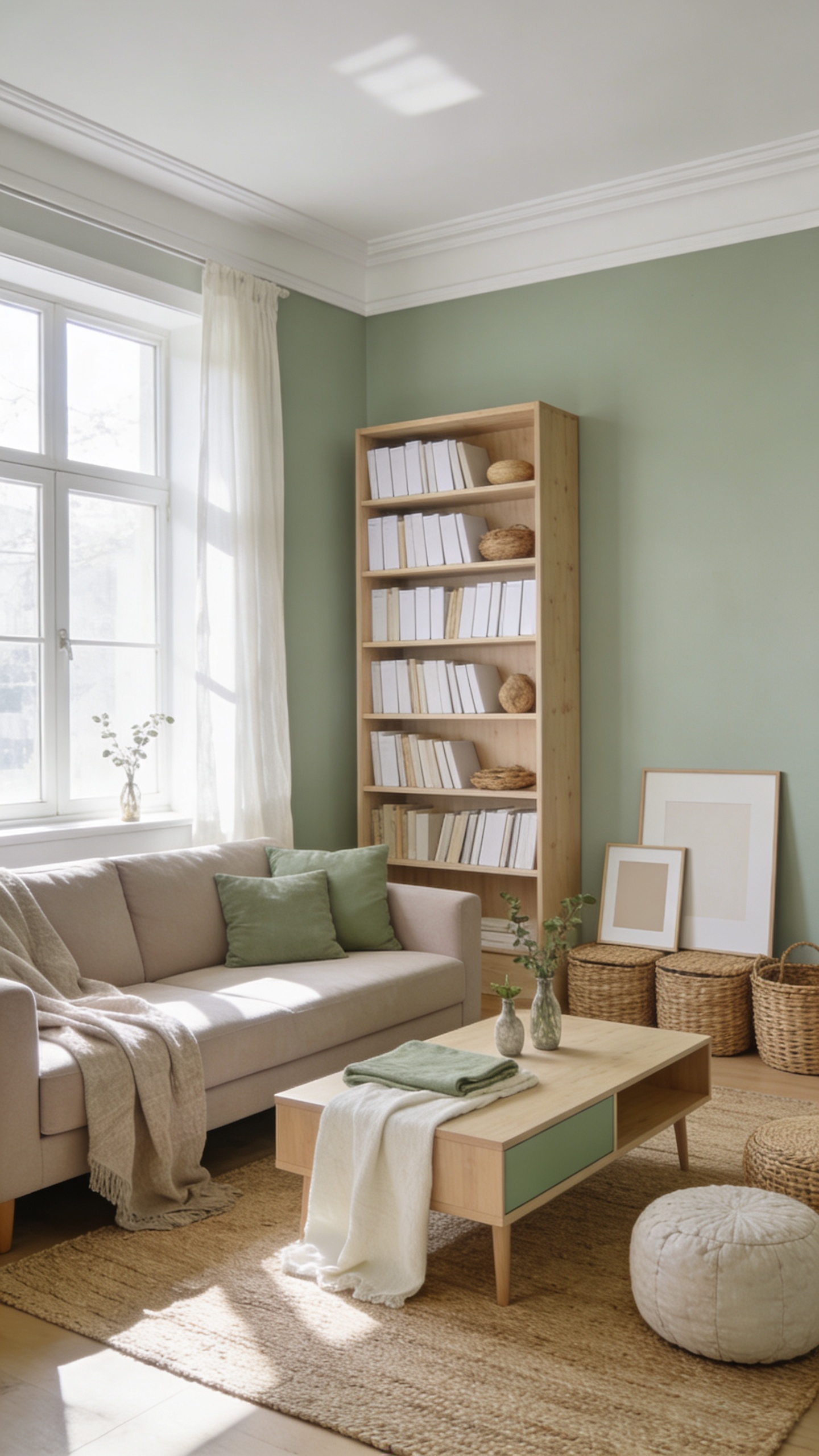
The secret here is contrast without drama. Pale neutrals give a seamless backdrop, while navy anchors the space and reads as depth rather than weight.
Color Palette
- Walls: pale gray-beige
- Accent: navy blue, soft cream, and natural wood
Key Pieces
- Navy sofa or chair as a focal point
- Light wood or whitewashed dining set
- Textured cushions in cream and taupe
Styling Tips
- Keep furniture lines slim to maintain sightlines
- Use coastal or breezy textiles to keep the space feeling open
Vibe check: calm, collected, and timeless. Perfect for a living room where you want to feel expansive but never cold.
3. Soft Sage and Warm White Combo
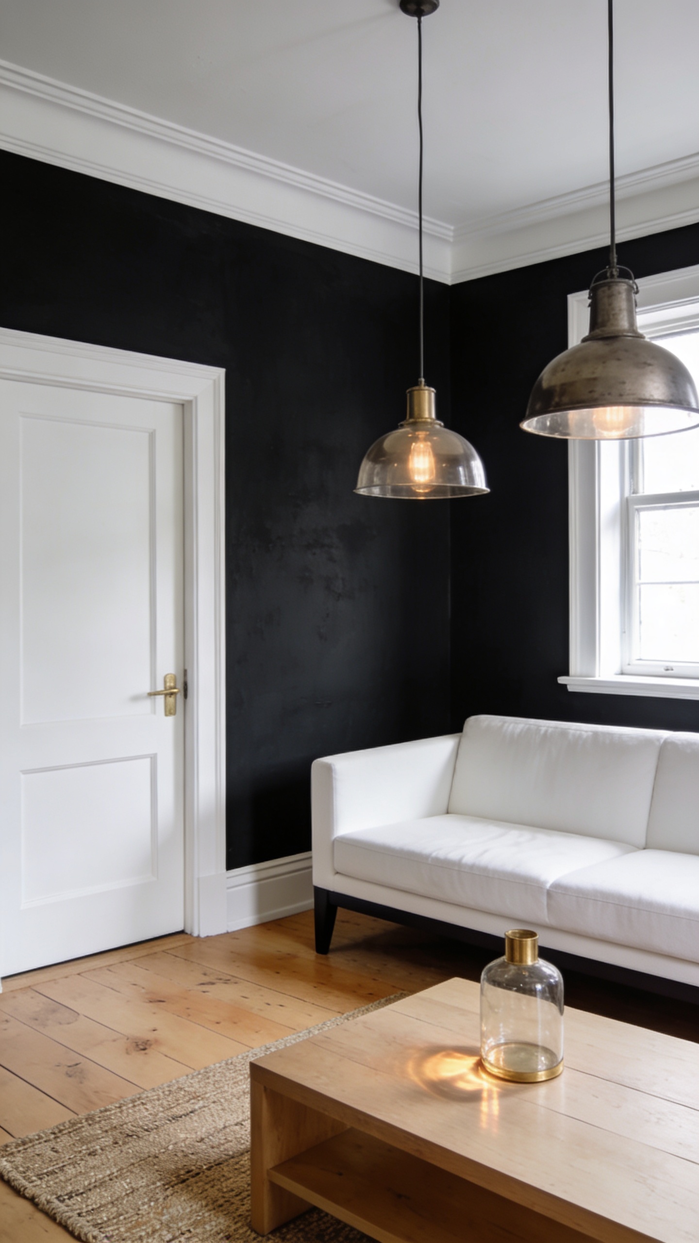
Nature-inspired greens feel expansive when paired with bright white trim. This palette nudges the room toward airiness while staying snug and inviting.
Color Palette
- Walls: soft sage
- Trim/ceiling: white, bright but not stark
- Accents: sage + ivory textiles
Key Pieces
- Neutral-toned sofa with a few sage cushions
- Wooden bookcase with light finish
- Woven jute rug to ground the space
Styling Tips
- Layer textures: linen, cotton, and wicker
- Add botanical elements in small vases or art
This vibe is for nature lovers who want a serene room that still feels spacious—think a peaceful reading nook or a sunlit lounge.
4. Cashmere Taupe With a Bright White Edge
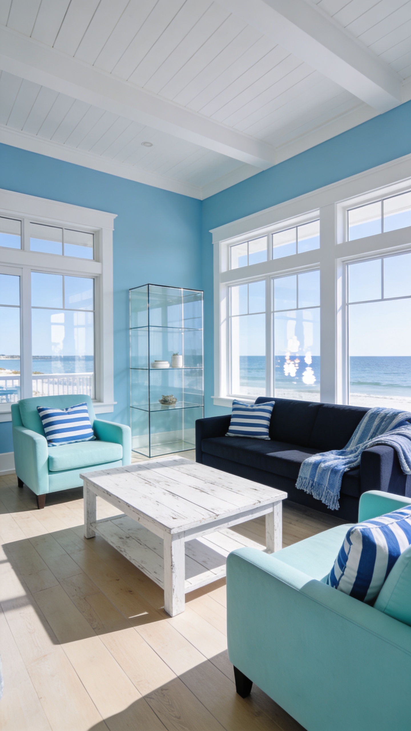
Warm neutrals get a lift from immaculate white trim and glossy surfaces. The effect: a cozy space that reads bigger because light bounces around like crazy.
Color Palette
- Walls: cashmere taupe
- Trim/ceilings: crisp white
- Accents: ivory, soft metallics
Key Pieces
- Tufted sofa in warm taupe
- Glossy sideboard or console to reflect light
- Metallic lamps with glass shades
Vibe: cozy-luxe with a modern edge. Ideal for a dining room or living room that needs warmth without shrinking the space.
5. Crisp Charcoal and White Architecture
Dark walls in the right rooms can expand a space by creating depth. Here, charcoal acts like a backdrop that makes lighter elements pop and the room feel taller.
Color Palette
- Walls: deep charcoal or graphite
- Trim: bright white to carve edges
- Accents: brass, glass, and natural textures
Key Pieces
- White sofa with dark legs
- Industrial-style metal lighting
- Light wood coffee table to soften the contrast
Who this is for: bold minimalists who want drama without sacrificing space. If you can lean into lighting tricks, this is your jam.
6. Soft Blush and Muted Greige Story
Romantic without being pastel-sick, this palette breathes warmth into a tight footprint. It feels bigger because the hues are gentle and cohesive.
Color Palette
- Walls: pale blush
- Accents: greige, ivory, champagne
Key Pieces
- Blush velvet armchair
- Light wood dining set
- Ivory linen drapes that catch the breeze
Vibe: sweet and airy, like a sunlit cafe. Use this in a bedroom or a petite living room to feel instantly taller and softer.
7. Oceanic Blues With White Woodwork
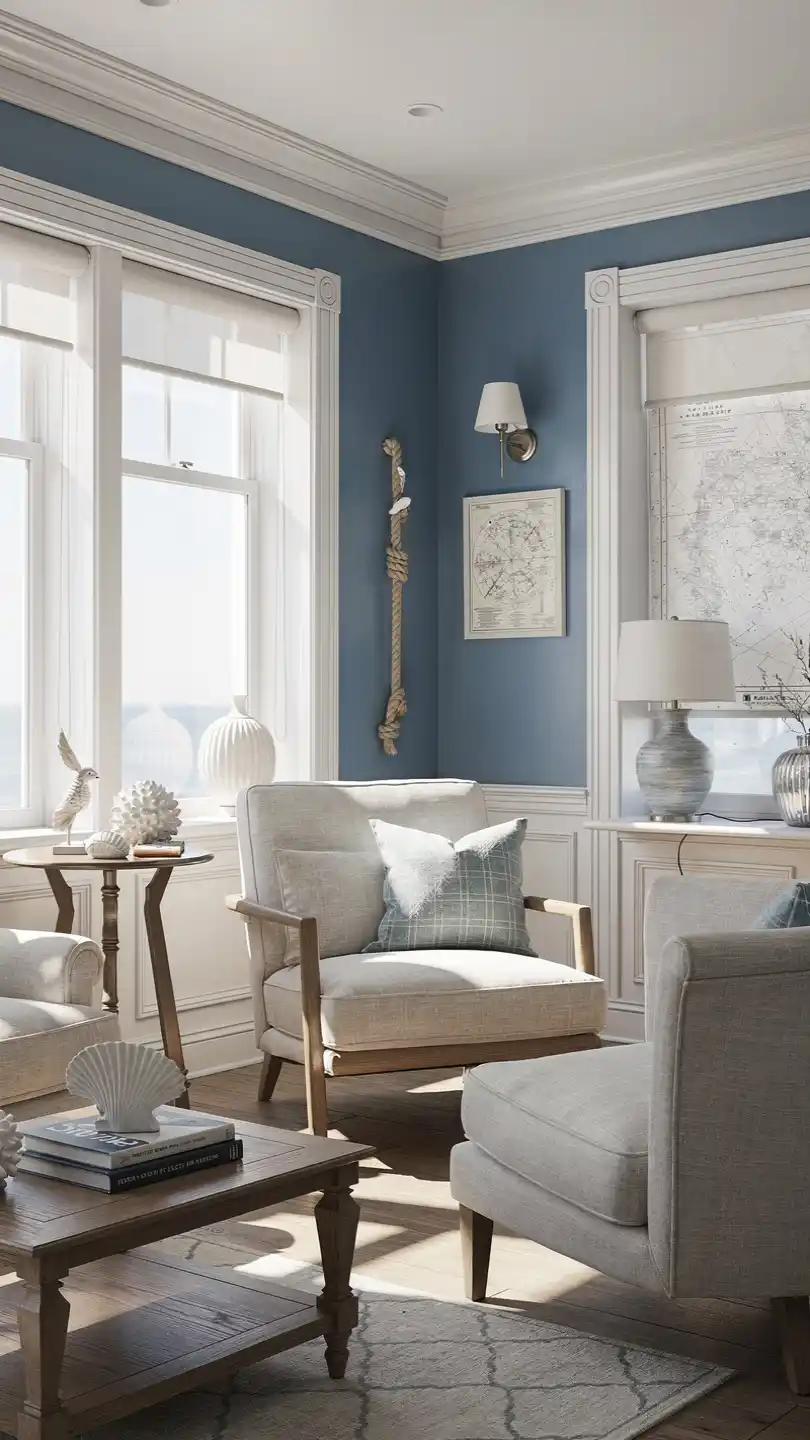
Think salty air, bright mornings, and windows that invite the entire horizon inside. Pale blues push light forward and visually widen the space.
Color Palette
- Walls: airy sky blue or soft cerulean
- Trims: white
- Accents: navy, teal, seafoam
Key Pieces
- White-washed coffee table
- Blue-and-white striped textiles
- Glass or acrylic shelving to keep lines clean
Perfect for a coastal apartment or a city flat with a view—this look invites the outdoors in.
8. Deep Emerald Accent Against Ivory Background
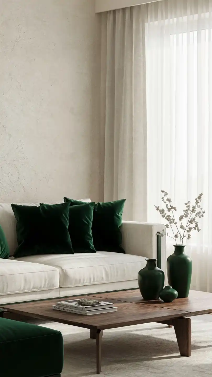
This design uses a single, saturated color as an anchor while keeping most surfaces light. The result feels expansive and lush without becoming dramatic.
Color Palette
- Walls: ivory or off-white
- Accent: emerald green in cushions, artwork, or a statement chair
- Metal: gold or brass tweaks for warmth
Key Pieces
- Emerald accent chair
- Ivory sofa with green throw blankets
- Artwork featuring green landscapes or botanicals
Vibe: luxe but approachable. Great for a sunlit living room that needs a color pop without shouting.
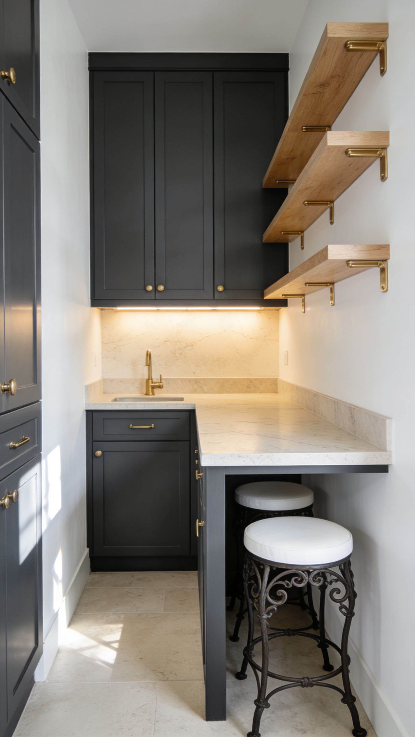
9. Graphite and Warm White Kitchen Nook
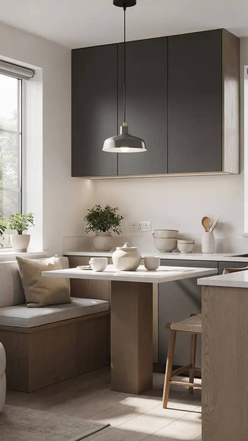
You can redefine a compact kitchen with color strategy, turning a plain nook into a bright, inviting space. Graphite cabinets pair with warm whites to feel taller and more open.
Color Palette
- Cabinets: graphite or charcoal
- Walls: warm white
- Accents: brass hardware, light wood, pale stone countertops
Key Pieces
- Open shelving in light wood
- Counter stools with white seats and wrought-iron legs
- Under-cabinet lighting to boost brightness
Bonus: this palette enlarges the vertical space—hello, tall cabinets that don’t feel crowded.
10. Linen Beige with Black Accents
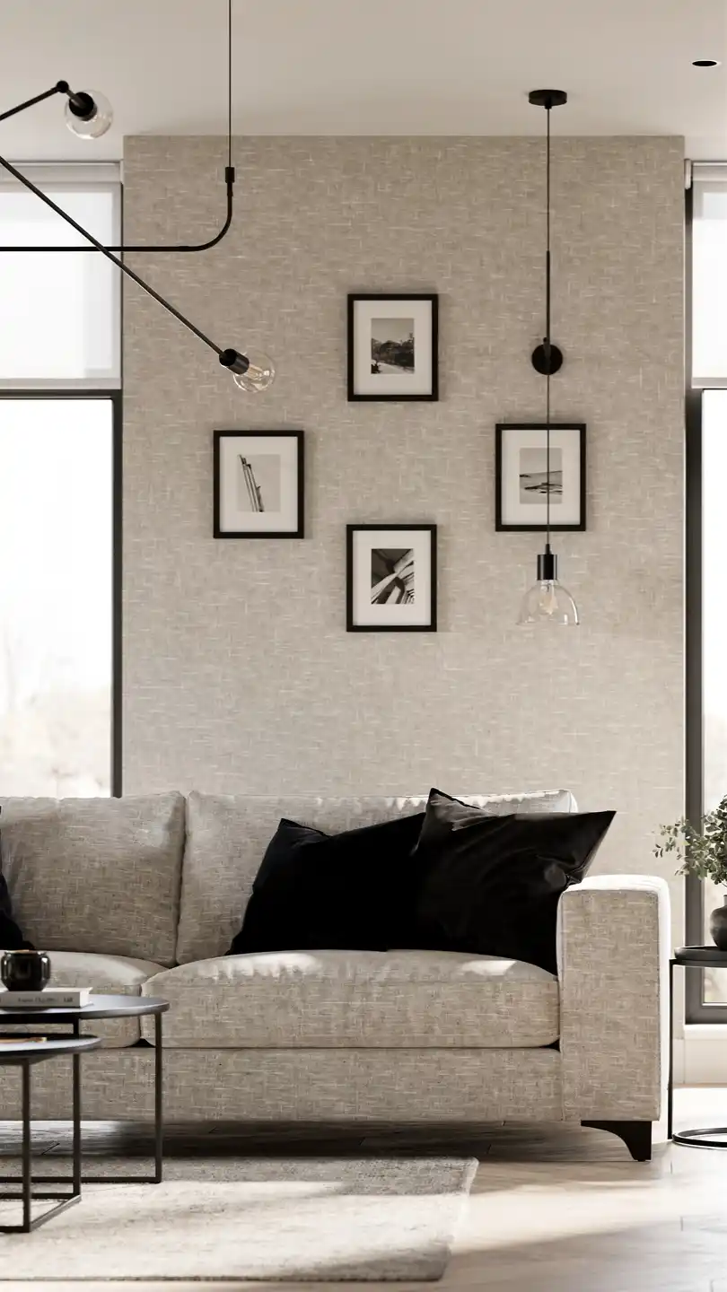
Beige and black create a refined contrast that reads clean and modern. The light beige walls keep the space airy while black details add depth and structure.
Color Palette
- Walls: soft linen beige
- Accents: black, charcoal, creamy white
Key Pieces
- Black-framed mirrors to bounce light
- Beige sectional with black metal legs
- Textured throws and cushions in black and white
Who will love this: minimalists who crave crisp edges and a gallery-like vibe in a small space.
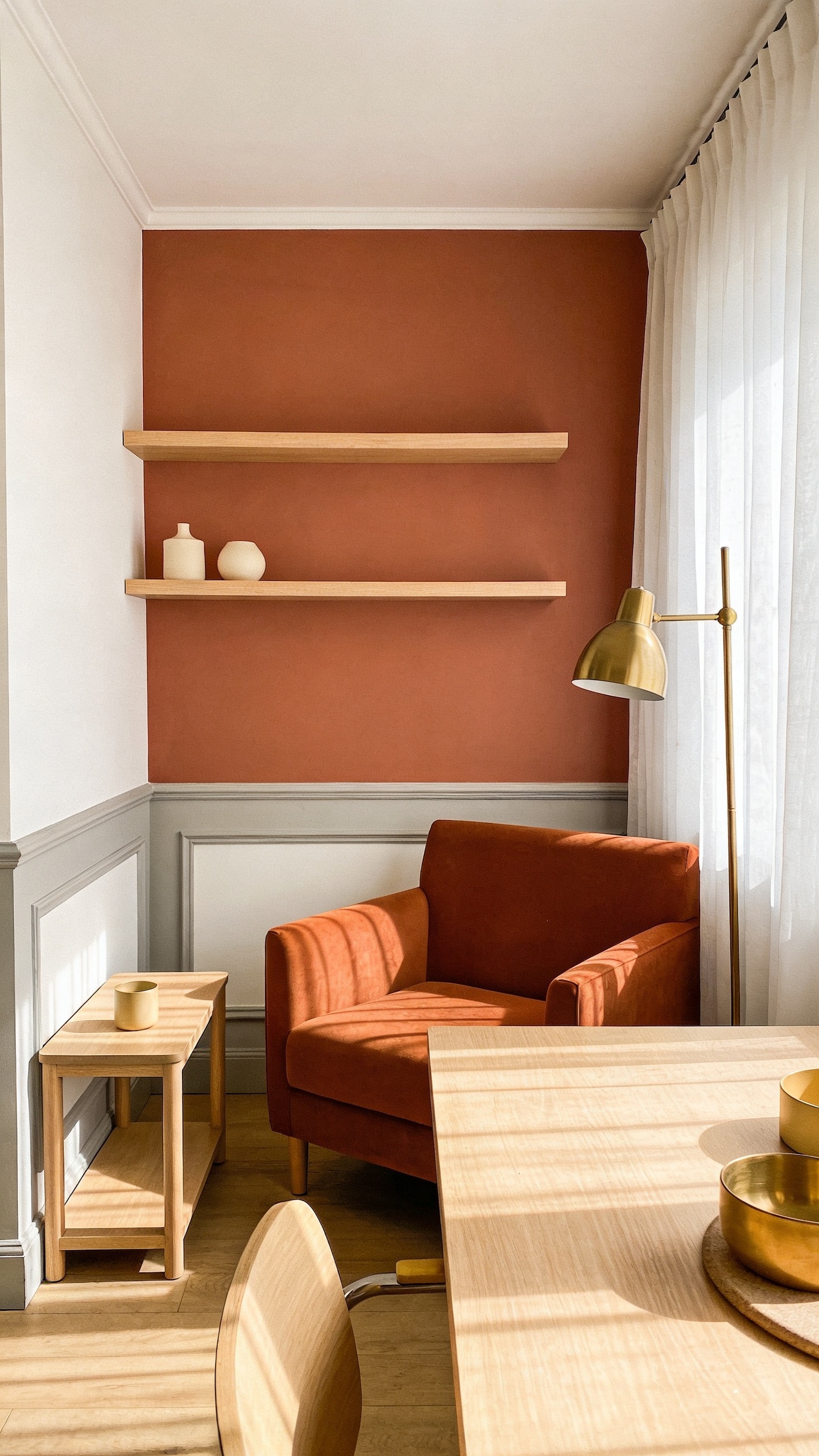
11. Terracotta Accent Walls With Light Neutrals
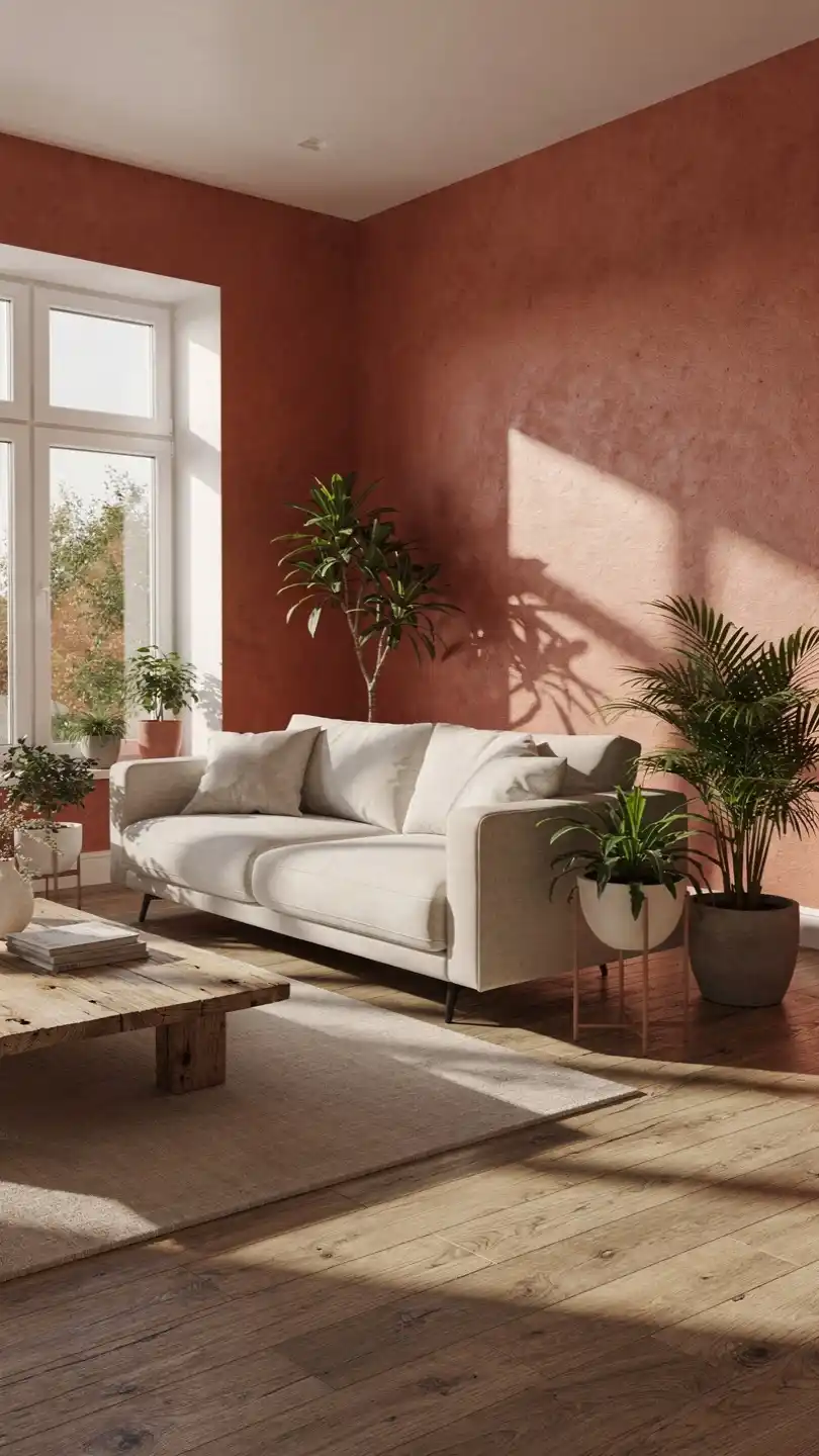
Yes, you can use a warm terracotta without shrinking a room. When balanced with light neutrals and lots of white trim, it expands the palette and makes the space feel larger and cozier at once.
Color Palette
- Accent wall: terracotta
- Remaining walls: soft white or pale gray
- Accents: cream, pale wood, and brass
Key Pieces
- Terracotta sofa or accent chair
- Light wood shelves and end tables
- White textiles and sheer curtains
Vibe: sun-kissed, earthy, and surprisingly expansive. Use this in a compact dining area or living room to add warmth without narrowing the view.
Conclusion
Ready to pick a color story and test it out in your own space? FYI, you can mix two of these palettes in adjacent rooms for a cohesive but varied home. Trust me, small spaces respond beautifully to thoughtful color choreography.
So go ahead—grab a swatch, invite some light in, and give your room a color makeover that makes it feel larger, brighter, and totally you.


